you can go HERE for a basic idea....
and then i kinda go over it here...
but i had a few questions on how i made my halloween pictures...so i thought i would give you another quick rundown...
now...before we begin..you are going to have to excuse my rush to do christmas stuff...i got a little ahead of myself ....but the rest are thanksgiving!
upload any picture...
click on the exposure button and bring over exposure, highlights and contrast to 100.
that will make your picture nice and white.....then i click on stickers and select the rectangle..
and use it to cover the whole thing.....
then to add stripes i use more rectangles...get one...get the right size and the right color and then right click on it and duplicate it...
that way they are all the same...then you can just click and drag them where they need to go....
then add whatever themed stickers or text you want...
then i just play around with it til i come up with something i like!
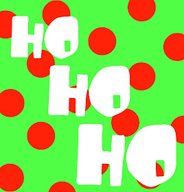
polka dots: (just circle stickers)
this step is super important: after you save....click on continue editing.....
it will take you back to what you were working on so you can take out the tree...
and swap it out for the pumpkin..
.then you can change out colors or images or fix the font til you have something you love
remember to use your fade button to get the best color!
most of the colors are really vibrant...so i click on a color i like and fade it out for a more softer tone!
i even did a dallas cowboy one cause i love my husband....
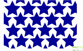
this one is just a star on a star on a star.....
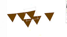
used some triangles to make a banner....
then got rid of the triangles..clicked on the doodle and made a string across....(the doodle let's you draw on your picture)
you can see the process of how i just move things around until i find one that really sticks...
I used stripes to make an ombre effect....
I just right clicked and duplicated the rectangle and then faded it out a little bit and repeated and repeated aned repeated..
something else that is super important and will be your best friend is the right click-- bring to the front...I usually put on words and then play with the background...so the rectangles are on top of the lettering. i just click on the lettering and bring it to the front and it will move it for me
(you can also send things to the back)
to make it so both the words have the color BUT different font...i type in the first word, find the color i like...and making sure that the word has the box around it.... over in the text bar i push add . i will add the same word again. i drag that word where i want it and retype another word and change the font.
it's a TON easier than trying to match colors!
now picnik tries to be tricky...and over some free stuff and some awesome premium stuff.
but if you go to featured --it usually has the holiday it is (like thanksgiving) everything that doesn't have premium on the side is up for grabs...
and if you scroll down to the bottom and click on need more?
you will get a ton of other great stickers that aren't on the stickers page
(like shiver me timbers is my favorite right now! so fun!
all of these are free for you personal use! remember if you need a specific size --picnik has a resize button!


Great tutorial!!!! Thanks so much for sharing!!
ReplyDeleteWe host a linky party every Tuesday called Help a Momma Out. Would love it if you linked up :)
Have a great day!
Kristine
J&M's Eye Candy Blog
J&M's Eye Candy on Facebook
J&M's Eye Candy Shoppe on Etsy
How Fantastic! Now I can play around with Picnik a bit more, I have been working on make buttons and banners lately for my own blog. Thanks so much!
ReplyDeleteThats fantastic! I'm definetely underutilising Picnik! Thanks so much for this - will come in very handy.
ReplyDeleteYay! Thanks for sharing!! This was very helpful.
ReplyDeleteThanks for sharing! These are fabulous! Gave me lots of ideas!
ReplyDeleteHugs
SueAnn