so my kitchen was apple green and brown with a little red and blue (you can see a couple befores HERE and HERE (these are very beginner posts of my blog!)...... but i found this from pinterest
and this one...
so i started slowing making it over...
first paint:
it's call fresh mint from dutch boy and it's the pretty color of blue that might have green in it...i'm super happy with...and it's pretty true to the paint chip...and with the door closed (in case it makes a difference)
can i take a moment of your valuable time to express my distaste for my culligan machine.
now..don't get me wrong. i love it. the cold water is well worth it. but it always shows up in pictures and kinda makes it look like a sore thumb...
and i was going to cover it with fabric...but i was afraid you all would think it was an april's fool joke or something....
anyways..i painted the main wall and the back splash... (i'm planning on painting the rest a bright white....but i wouldn't hold my breath if i were you)
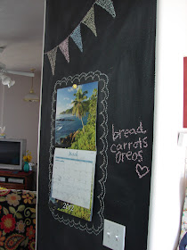
the chalkboard wall starts us off
if you walk straight you run into my table
the view into the living room....
see those plates in the corner? they are the post that was supposed to schedule yesterday....
next to them is my door...
if this was my house you can bet your bottom dollar that those cupboards would be painted white....but since it's not my house....you get what you get and you don't throw a fit.
this corner is where i stash all those mason jars that i hoard
I had to redo my menu board:
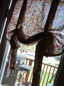
and added some new fabric behind my frame...
rainbow print
recover a lamp into a drum shade
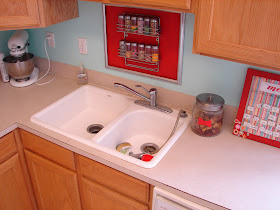
painted mason jars
(it's mostly dog food and my husbands muscle inhancing crap)


Do we have the same husband? I have all that crap on my counter too? I was thinking of getting a huge cookie jar with a chalkboard label for the protein.....
ReplyDeletetoo many ???? :)
ReplyDeleteA super cute kitchen. You really tied everything together with super cute details. Have you thought about dressing up the bottom half of your water cooler with vinyl? I thought the fabric on top was a good idea too.
ReplyDeleteIt looks amazing!! You are so brave to do those fun colors. I really really want to add some aqua to my all natural living room, but I am too afraid to take the plunge. Really I just need to get over it, and DO IT!!
ReplyDeleteThanks for sharing, I LOVE how it turned out!!
for the water cooler you need to build a barn wood (or any distressed wood) cabinet and whitewash it with your wall color. Open back so it slides forward to replace the jug, and just a section missing in the front for dispensing.
ReplyDeleteAdorable! I love it! I have the same problem with my water dispenser, so I feel your pain!
ReplyDeletecute cute!! Love the colors!
ReplyDeleteI absolutely LOVE the fact that you moved the 'stuff' and then took a picture of it! HA! To funny!
ReplyDeleteLuv it!!!!!
ReplyDeleteAwesome! I live at... ;)
ReplyDeleteAdorable!! And you call THAT a mason jar hoard??? Oh girl...I can out do that times 20...
ReplyDeleteWhy not paint the culligan stand? I am thinking aqua with white poka dots!
ReplyDeleteit looks awesome...and I agree...paint the mulligan stand...
ReplyDeleteWow! It looks fantastic!!
ReplyDeleteThat came out so cute. I think the perfect word for it is "friendly" That is the friendliest kitchen. I would feel perfect making myself at home. I love it!
ReplyDeleteI love it all but I think you need to paint the blue above the cabinets too. I love the red accents!
ReplyDeleteI love this color scheme! The fresh mint is a great accent wall color! Pops of red everywhere are so fun too! It's so much happier now!
ReplyDeleteWow i really like your kitchen. Who knew that red and mint were fabulous together?!
ReplyDeleteI love all the details.
But....
"bon appetite" is wrong. You have to write "bon appétit" ;-)
Way cute and cozy -- I love it! Even with the Culligan machine. Sometimes you have to deal with the non-cute-necessities. Cracks me up that you took a picture of the "crap" that most normal people have on their kitchen counters. I was starting to feel like you were one of those perfect moms...
ReplyDeleteUmmm, plate tutorial soon??? please! I LOVE vinyl plates. Here iare some from my new collection.
ReplyDeletehttp://hurleythurston.blogspot.com/2012/05/holiday-plates-series-mothers-day.html
WoW! Totally WoW! Can I move in? Will you makeover my kitchen? Sigh. Love it!
ReplyDeleteSuch a bright, fun, cheery kitchen. Nice job. The lamp is my favorite part!
ReplyDeleteI love how you kept it real and posted about the stuff you took off the counters! ha ha...the junk on my counters is usually my son's one million craft projects he has in progress....I wonder where he gets that from? :)